Your living room is where the whole house comes together, where you unwind, entertain, and spend countless hours. Paint color might seem like a straightforward choice, but it’s arguably the most impactful design decision you’ll make in that space. A thoughtful color scheme shapes mood, defines the room’s character, and can either make your furniture and décor sing or fall flat. Whether you’re a homeowner thinking about refreshing a tired living room or a DIY enthusiast ready to wield a brush, understanding which color palettes work best will save you money, time, and regret. Let’s walk through the major strategies for 2026 so you can pick a scheme that actually works for your home, your light, and your lifestyle.
Table of Contents
ToggleKey Takeaways
- Color schemes for living rooms set mood and character, making paint selection the most impactful design decision in the space.
- Warm neutrals like creams, beiges, and greige provide a flexible, timeless canvas that works in most homes and photographs well.
- Cool-toned palettes including soft blues, sage greens, and cool grays create calm, spa-like atmospheres but may feel cold in rooms with limited natural light.
- Bold accent colors—jewel tones for drama or vibrant pops for energy—work best on a single accent wall rather than all four walls to avoid visual fatigue.
- Monochromatic color schemes using varying shades and saturation levels of one color family create sophisticated, intentional spaces that feel curated.
- Proper prep work including paint sampling under different lighting, quality primer application, and multiple coats ensures your chosen color scheme reads true and lasts.
Warm Neutrals: Creating Timeless Comfort
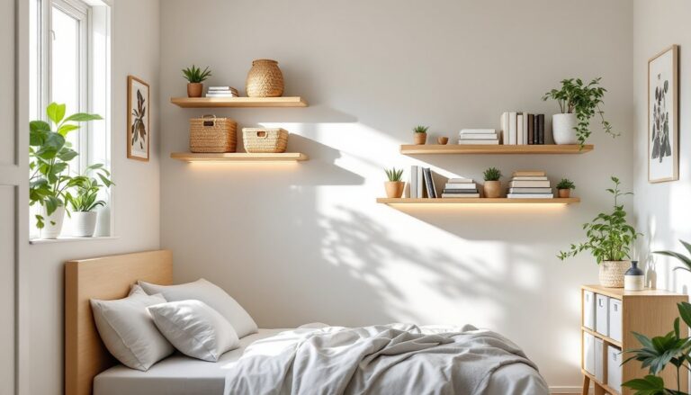
Warm neutrals remain the backbone of residential interiors because they genuinely work in most homes. These include creamy whites, soft beiges, warm grays (sometimes called greige, a hybrid of gray and beige), taupe, and light browns. Unlike cool, sterile grays, warm neutrals feel inviting and anchor a room without demanding attention.
The biggest advantage of warm neutrals is flexibility. They’re the perfect canvas for layering in accent colors through furniture, art, and textiles. A warm cream wall lets your sofa’s leather patina, your bookshelf styling, and your artwork be the stars. Warm neutrals also photograph well, one reason designers and high-end real estate lean into them.
When selecting a warm neutral, grab paint samples and tape them to your walls for at least 24 hours. Watch how they shift in morning light, afternoon sun, and evening lamplight. A warm white that looks perfect at noon might read too yellow-gold under incandescent bulbs. Primer is critical here: if you’re covering darker colors or stains, use a quality bonding primer to ensure your finish paint color reads true. Two coats of finish paint (typically 350–400 square feet per gallon) usually covers living room walls effectively, though you may need three if switching from a dark color.
The risk with warm neutrals is blandness if you don’t layer intentionality behind them. A room painted in warm taupe with beige furniture and cream curtains can feel like nothing at all. Combat this by introducing textural contrast, a jute rug, linen curtains, or a woven accent wall, and by varying your décor values (light, medium, dark) within the neutral spectrum.
Cool Tones: Calm and Serene Living Spaces
Cool-toned living rooms, blues, cool grays, soft greens, and pale purples, create a tranquil, almost spa-like atmosphere. This palette works especially well if your living room receives plenty of natural light or if you want a retreat from a busy household. Cool grays in particular have become mainstream as design has shifted away from the yellow-undertoned grays of the previous decade.
Blues are the workhorses of cool palettes. Soft sky blues, dusty blues, and navy create depth and calm. Sage greens and muted teals are having a moment and pair beautifully with natural wood and vintage brass fixtures. Cool grays, look for undertones of blue, green, or purple rather than brown, feel contemporary without being trendy or dated.
One real consideration: cool colors can feel cold in rooms with limited natural light or in homes in genuinely cold climates. A soft blue living room in a room that gets sun only in early morning might feel dreary by evening. Counteract this by warming the space with warm-toned wood furniture, warm-toned lighting (2700K LED bulbs are warmer than 5000K), and warm textiles like rust or terracotta accents. Interior design guides like MyDomaine showcase how designers layer cool wall colors with warmer furnishings to achieve balance.
Prep work for cool-toned walls is the same as warm neutrals, sample, observe, and prime if necessary. Cool colors sometimes need an extra coat because they’re more transparent: budget for three coats if covering deep warm tones.
Bold Accent Colors: Making a Statement
If warm neutrals and cool tones feel too safe, bold accent colors let you push further. These walls become focal points and set a room’s energy immediately. You’ve got two directions here: jewel tones for drama and sophistication, or vibrant pops for playfulness and energy.
Deep Jewel Tones for Drama
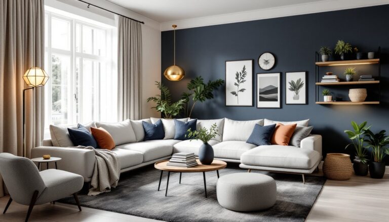
Deep jewel tones, emerald green, sapphire blue, burgundy, oxblood red, and rich purple, add instant character and elegance. These colors work best on one accent wall or in rooms where you’re committed to a specific mood. They demand quality paint and good prep because imperfections show at this depth: a semi-gloss or satin finish (rather than flat) helps them glow and hides brush marks better.
Jewel tones pair well with gold, brass, and warm wood tones. A burgundy accent wall, warm oak trim, and brass sconces create a cozy, upscale feel. Designer-approved paint colors like navy, olive, and oxblood consistently appear in high-end interiors because they anchor a space without overwhelming it when paired thoughtfully with furnishings.
Forecast for the accent wall: paint it twice, and don’t rush. Deep colors need two solid coats minimum (sometimes three) to avoid streaking. Use a quality paint roller with a 3/8″ nap to ensure even coverage. Plan for 350–400 square feet per gallon even on darker colors.
Vibrant Pops of Color
Vibrant accent colors, coral, mustard yellow, bright teal, or even hot pink, work in living rooms where personality is the goal. These are riskier long-term because they can feel dated quickly, but they’re undeniably energizing. The safest approach is to paint a single accent wall rather than all four, giving yourself an escape route if the color fatigues you.
Vibrant walls need visual anchors: warm or cool neutrals on the other three walls, grounding furniture (dark or neutral pieces), and balanced lighting to prevent the color from becoming overwhelming. Many DIYers make the mistake of painting an entire room in a vibrant shade and then feeling trapped by it. One accent wall, carefully considered, gives you the energy boost without the regret.
With vibrant colors, primer becomes non-negotiable if you’re covering existing paint. Use a bonding primer to block tannins and stains, then apply two full coats of your finish paint. The extra coverage ensures the color reads as intended without relying on additional topcoats.
Monochromatic Palettes: Sophistication Through Simplicity
Monochromatic color schemes use a single color family at varying shades and saturation levels, from pale blue walls to deeper blue accents to navy details. This approach creates visual cohesion without flatness because the value variation (light to dark) keeps the eye moving.
Monochromatic living rooms feel intentional and curated. A room painted in soft sage with darker sage trim, a forest green sofa, and lighter green artwork creates a sophisticated, restful space. Monochromatic schemes work with any color, blues, grays, greens, even warm taupes, and suit both minimalist and layered design aesthetics.
The DIY application is straightforward: pick a base color (usually a medium shade), then source paint samples at lighter and darker values. Paint walls in the base shade, trim in a slightly darker shade, and introduce accents through furnishings and art in the darkest value. Monochromatic palettes are forgiving because any shade within that color family reads as intentional rather than accidental.
One practical note: if you’re painting trim a darker shade than walls, invest in a quality painter’s tape (Frog Tape or similar with an acrylic-based adhesive) and burnish the edges firmly. Allow the base coat on walls to dry fully before masking, and remove tape while the trim paint is still slightly tacky rather than fully dry to avoid peeling the wall paint. Home design inspiration often showcases monochromatic schemes because their coherence photographs beautifully and appeals to both traditional and contemporary tastes.
Conclusion
Your living room color scheme doesn’t have to be trendy or risky to feel right. Start with honest assessment: How much natural light does the room get? What’s your furniture and fixture style? Do you prefer calm or energizing spaces? From there, sample generously, observe across light conditions, and trust your instinct. Prime properly, apply paint carefully, and remember that color confidence comes from good prep work, not perfect first instincts. Your room will reflect the care you invest in choosing it.