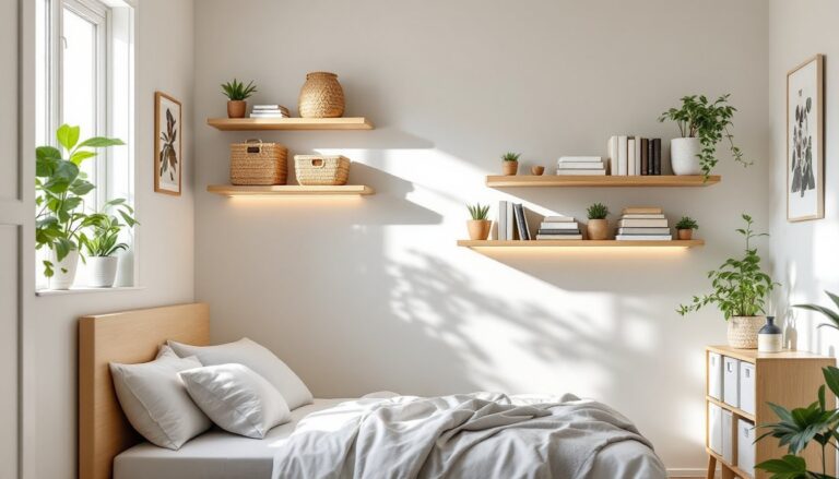
A fresh coat of paint and smart furniture choices can transform your living room from dated to deliberate. Two-colour schemes offer homeowners a practical way to add visual interest without overwhelming the space, they’re bold enough to feel intentional, yet manageable for DIY application. Whether you’re pairing soft neutrals or embracing contrast, the key is understanding which combinations work together and how to apply them cleanly. This guide walks you through proven two-colour pairings, application techniques, and testing methods so you can execute your design with confidence.
Table of Contents
ToggleKey Takeaways
- Two-color schemes for living rooms strike the perfect balance between simplicity and sophistication, providing visual interest without overwhelming the space or demanding complex upkeep.
- Successful modern two-color combinations rely on a dominant neutral base (warm white, soft gray, or greige) paired with a carefully chosen accent color that defines zones and draws the eye.
- Test paint samples in large swatches under your actual lighting conditions for 3–5 days before committing, as incandescent and LED bulbs dramatically alter how colors appear throughout the day.
- Apply the 60-30-10 design rule to prevent either color from dominating: use 60% dominant neutral, 30% accent color, and 10% bridging accent trim for visual balance.
- Accent walls, trim work, furniture placement, and ceiling treatments are equally effective ways to implement two-color schemes, with each method offering different levels of commitment and reversibility.
- Popular modern two-color pairings like soft gray plus navy, warm greige plus deep green, and cream plus soft black deliver contemporary, intentional looks that work across various architectural styles.
Why Two Colour Schemes Work Best For Modern Living Rooms
Two-colour schemes strike the right balance between simplicity and sophistication. A single colour throughout feels flat: three or more can feel chaotic. Two colours let you anchor the space with a dominant shade, then introduce visual hierarchy with a carefully chosen accent.
Modern living rooms benefit from this approach because it supports open-plan layouts and mixed materials. A neutral base, think warm white, soft gray, or warm greige, provides continuity, while a second colour on an accent wall, trim, or furniture draws the eye and defines zones without physical barriers. This matters if your living room flows into a kitchen or hallway.
Two-colour combinations also make repairs and updates easier. If you need to touch up paint, repaint a wall, or refresh upholstered pieces, you’re managing two product families instead of five. Consistency in colour family keeps costs down and simplifies future renovations.
Neutral And Accent Colour Pairings
Neutral bases remain the safest starting point for most living rooms because they accommodate changing décor and different lighting conditions throughout the day.
Warm White + Terracotta or Rust: Warm whites (off-whites with yellow or red undertones) pair naturally with earthy accent colours. Apply terracotta or rust to a single accent wall or large furniture piece, a sectional, built-in shelving, or feature wall behind a media console. This pairing works especially well in rooms with warm wood tones or natural light from south-facing windows.
Soft Gray + Navy or Charcoal: Gray has become a living room staple for good reason, it’s adaptable and modern. Pair a light to medium gray wall with navy or charcoal on trim, doors, or a statement piece like a bookshelf or headboard wall if your living room adjoins a bedroom area. This combination feels contemporary without trending toward cold or sterile.
Warm Greige + Deep Green: Greige (a blend of gray and beige) has replaced pure gray in many modern homes because it feels warmer. Pair it with a deep, muted green, forest, sage, or olive, on an accent wall or large upholstered pieces. This pairing draws from nature and works well in rooms with lots of natural materials like linen, jute, or wood.
Cream or Ivory + Soft Black or Charcoal Trim: If you want higher contrast, paint walls cream or ivory and use a softer black or charcoal on trim, door frames, or a feature wall. This combination feels deliberately modern and works particularly well in rooms with strong architectural details like crown moulding or built-ins that benefit from definition.
Bold And Balanced Colour Duos
Bold two-colour schemes demand a clear hierarchy: one colour dominates (usually a neutral or lighter shade), and the second introduces personality.
Soft White + Blush or Mauve: Blush and mauve aren’t just for bedrooms. A light, desaturated blush or mauve works as an accent wall in living rooms with plenty of natural light. Keep walls or trim white and introduce the accent on one wall, a painted ceiling, or large upholstered furniture. This creates a sophisticated, modern look without the sugary feel of hot pink.
Pale Yellow + Warm Gray: Pale, muted yellows (think butter, not highlighter) pair beautifully with warm grays. This combination feels energetic without being jarring. Use the pale yellow on walls and gray for trim or vice versa, depending on how bold you want the effect. A ceiling painted in the accent colour also adds unexpected depth.
Soft Blue + Warm Beige: Cool blues paired with warm beiges create tension in the best way, they’re slightly unexpected together, making the space feel intentional. Apply soft blue to an accent wall and warm beige to surrounding walls, or reverse it for a more dramatic effect. This pairing suits rooms with mixed metal finishes (brass, matte black, stainless steel).
Black or Charcoal + Warm White: High contrast isn’t everyone’s preference, but when executed cleanly, it reads as confident and modern. Paint walls a clean warm white and use charcoal or soft black on trim, a feature wall, or a built-in. This pairing sharpens sightlines and works especially well if your living room has strong architectural bones.
Modern two-tone colour schemes featured in design publications, such as 20 two-tone living room ideas from House Beautiful, demonstrate how these pairings translate to real spaces across various aesthetic preferences.
How To Apply Two Colour Schemes To Walls, Furniture, And Decor
Application method determines how boldly your two colours read in the space.
Accent Walls: An accent wall is the easiest entry point for two-colour schemes. Paint one wall in your secondary colour, typically behind a sofa, media console, or fireplace, and leave remaining walls in your neutral base. This approach adds visual interest without overwhelming the room. Ensure your wall prep is solid: fill drywall imperfections with joint compound, sand smooth, and prime before painting. A single coat of primer followed by two coats of paint in your accent colour produces the cleanest finish.
Trim and Architectural Details: Paint all trim, doors, and moulding in your secondary colour while walls remain neutral. This technique highlights architectural features and creates visual continuity across rooms. It requires steady hands and good masking tape technique, but it’s highly effective in homes with pronounced millwork. Standard interior trim paint is typically semi-gloss or satin finish for durability.
Furniture Placement: Let furniture establish your two-colour scheme instead of paint. A neutral wall acts as a backdrop for a coloured sectional, painted bookshelf, or accent chairs. This approach is reversible, if you tire of the colour, you swap the furniture rather than repaint walls. It’s also forgiving if you’re renting or unsure about commitment.
Ceiling Treatment: A painted ceiling in your accent colour creates sophisticated depth. Paint walls in your neutral base and the ceiling in your secondary colour. This works best in rooms with 9-foot ceilings or higher: lower ceilings painted in darker colours can feel compressed. Prime all ceiling surfaces and use paint formulated for ceilings (it has additives to prevent drips and improve coverage). Two coats are standard.
Mixed Materials: Combine paint with textiles and finishes. A neutral wall with a deep-coloured sofa, a patterned rug that bridges both colours, and consistent metal finishes (brass, matte black, or brushed nickel throughout) ties the scheme together. This layered approach feels intentional and modern.
Examples of contemporary two-tone living room designs, available in 15 two-tone living room ideas from Domino, illustrate practical execution across different spatial configurations.
Testing Your Colour Combination Before Committing
Paint mistakes are expensive and labour-intensive to correct. Test thoroughly before you commit a full room to colour.
Sample Swatches: Buy sample-size paint in both colours, most retailers offer 8-ounce or 16-ounce sample pots under $5 each. Paint large swatch squares (at least 2 feet by 2 feet) directly onto drywall or use poster board taped to the wall. Leave samples up for 3–5 days and observe them at different times of day: early morning light, midday sun, and evening artificial light all shift colour perception significantly. This prevents the dreaded “colour-matched wrong” frustration after a full room paint.
Lighting Matters: Warm incandescent bulbs (2700K) make colours appear warmer and mellow. Cool LED bulbs (4000K–5000K) make colours appear cooler and slightly grayer. Test your samples under the lighting you’ll actually use. If you’re considering a lighting upgrade, factor that into your colour choice.
Furniture Mockups: Before painting an accent wall, place furniture pieces you plan to use in front of that wall. A bold accent wall might clash with a coloured sofa you already own. Seeing the combination before paint goes on the wall prevents costly corrections.
Digital Tools and Reference Images: Use paint apps or design software to visualize your room with different colour combinations. While digital representations aren’t perfect, they help you narrow choices. Also, interior design tips and home styling guides from MyDomaine showcase real-world two-colour applications that can inspire your selections and clarify what works visually.
Rule of 60-30-10: Apply this classic design principle: 60% dominant colour (usually your neutral), 30% secondary colour (your accent), and 10% accent trim or decor in a third bridging shade. This ratio creates visual balance and prevents either colour from overwhelming the space. It’s a useful framework when deciding how much of your second colour to apply.
Once you’ve settled on your combination, gather paint in your chosen sheen (flat for walls, satin or semi-gloss for trim), prime if needed, and plan your application carefully. Take your time with masking and surface prep, that’s where most visible results come from.
Conclusion
Two-colour schemes offer modern living rooms a straightforward path to intentional, sophisticated design. Whether you choose neutral-and-accent pairs or bolder complementary duos, the key is testing before committing and applying colour thoughtfully, through walls, trim, furniture, or a combination of all three. Proper surface prep, quality paint, and honest observation of how light moves through your room ensure results that look professionally executed and feel personal to your space.